
Company:
Moody's
Role:
Senior UX designer
Work I did:
UX/UI design
UX/UI audit
User research
Transforming complex compliance data into actionable dashboards and reports for better risk decision-making.
01/
background
Maxsight is a compliance and risk management platform by Moody’s that helps companies assess and monitor the risk of their customers, suppliers, and partners.
Platform combines customer’s internal data with Moody’s data and external sources, then applies analytics, automation, and AI to give a comprehensive view of risk and help teams manage it more effectively.
Reporting plays a key role in helping teams understand this data at a portfolio level and support decision-making and audits.
02/
problem
Before Reporting, risk data was scattered across multiple checks with no unified view, forcing users to manually compile information for audits and presentations. This made it difficult to understand the full risk picture, compare portfolio risk, and communicate decisions clearly. The later introduction of Tableau improved analytics but created a fragmented experience, with inconsistent UI and unclear UX.
03/
Role & Scope
I joined as a Senior UX Designer when Tableau had just been introduced. My key scope included UX/UI audit of Tableau dashboards, redesigning filtering, native design for Risk Overview dashboard and redesigning export experience.
04/
goals
- Improve clarity and usability of complex risk data
- Make reporting more actionable for decision-making
- Enable flexible filtering and segmentation of data
- Improve data exporting experience
- Ensure a more consistent experience across native and Tableau dashboards

Process
01/
Audit & understanding constraints
I started with a UX/UI audit of the newly introduced Tableau dashboards. The goal was to identify inconsistencies, usability issues, and gaps between the Tableau UI and the native product.
A key part of this step was understanding technical constraints — what could and couldn’t be customised within Tableau. This helped define realistic design boundaries and ensured that solutions would be feasible to implement.
02/
Research & understanding user workflows
In parallel, we reviewed existing research and conducted additional user interviews with a UX researcher. The goal was to understand how compliance teams actually use reporting in their day-to-day work.
One key insight was that dashboards were only part of the workflow — users often needed to export data and adapt it externally for audits or stakeholder communication. This highlighted the importance of supporting not just exploration, but also sharing and exporting.
03/
Defining structure & priorities
Based on audit findings and research insights, I worked with the PM to define the scope and prioritise key areas of improvement.
We focused on:
- Improving clarity of dashboards
- Making filtering more intuitive and useful
- Ensuring consistency across native and Tableau experiences
- Strengthening export functionality
This step helped align design decisions with both user needs and business priorities.
04/
Design exploration & iteration
I explored different ways to structure dashboards and present complex data, focusing on clear hierarchy and actionability. This included defining what information should be shown on each dashboard and how users could effectively segment and compare data through filtering.
The work was highly iterative, with frequent feedback from PM and engineers, especially due to Tableau constraints. Rather than aiming for ideal solutions, I focused on designing the best possible experience within real limitations.
05/
Collaboration & implementation
I worked closely with engineers throughout the process, particularly when refining UI within Tableau and implementing filtering logic.
We continuously aligned on trade-offs and iterated on solutions to achieve a more cohesive and consistent reporting experience across the product.
Solutions
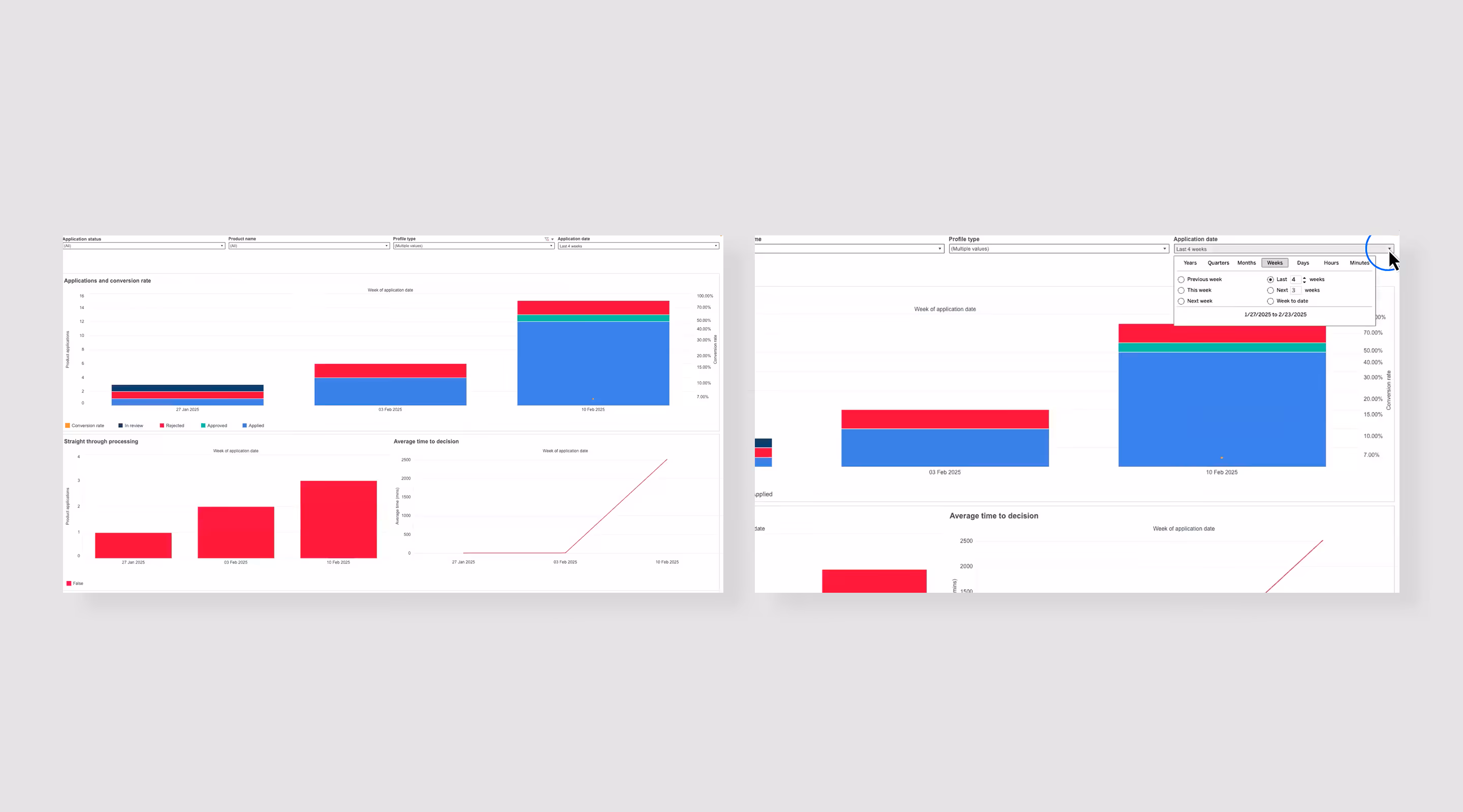
Improving Tableau dashboards
Given the technical constraints of Tableau, the focus was on improving what we could control — aligning layouts with the design system, clarifying information hierarchy, and refining filtering to make dashboards more usable and actionable.
I also worked on defining what information should be shown on each dashboard, ensuring each view was aligned with specific user needs rather than exposing all available data.
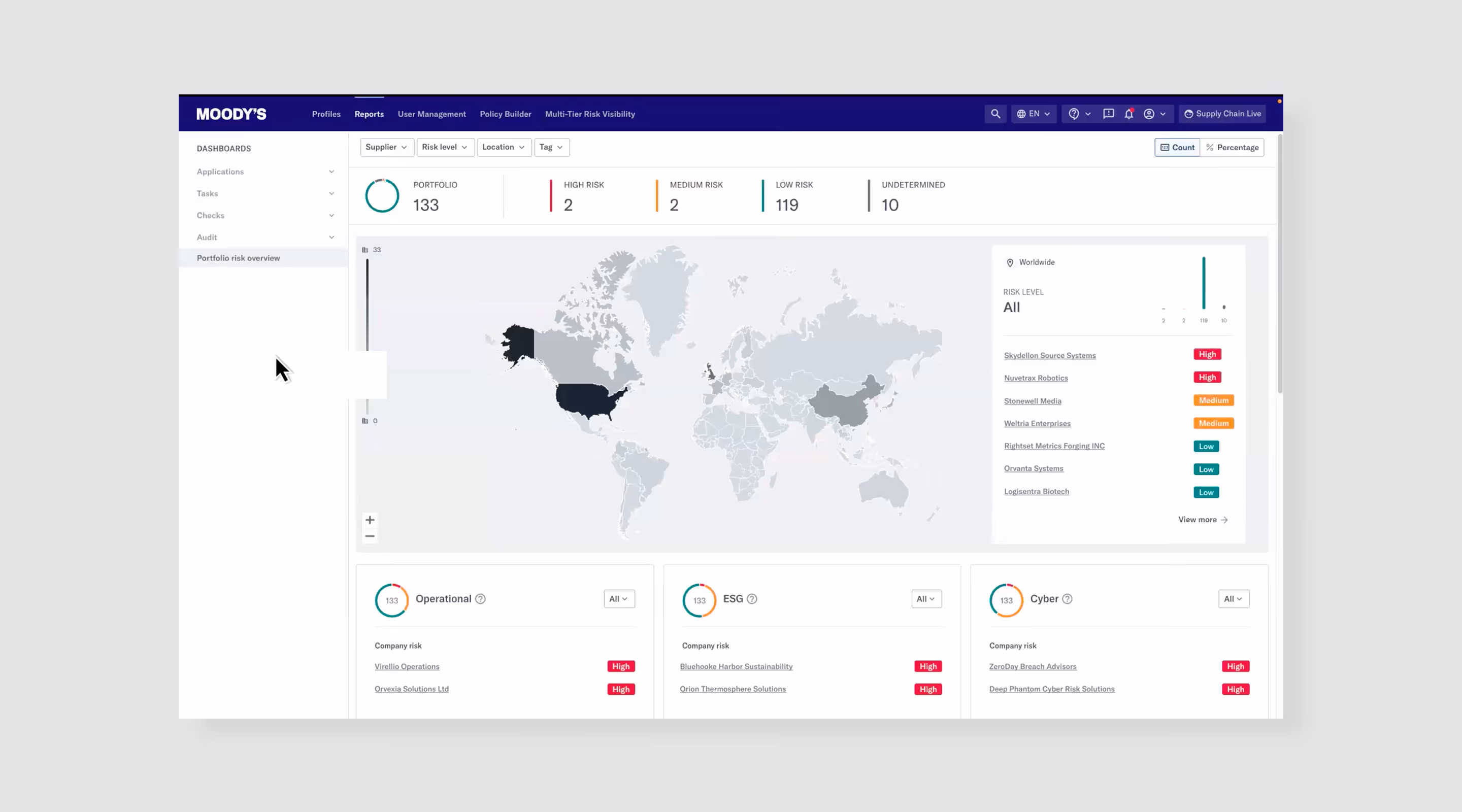
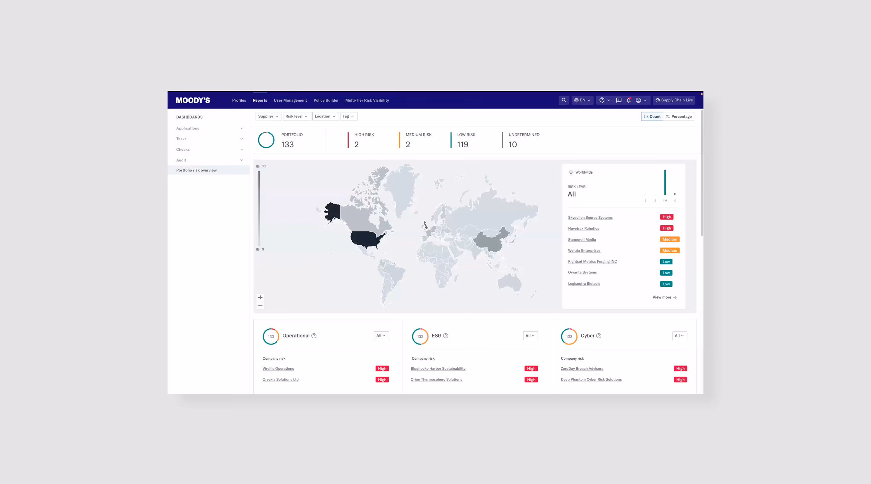
Native Risk Overview dashboard
The Risk Overview dashboard was built natively as the core entry point for Reporting. Here focus was a clear, high-level view of portfolio risk, rather than deep analysis, with the ability to take mitigating actions directly from the dashboard.
Keeping it native allowed us to ensure better performance, consistency, and tighter integration with the product. It also enabled more actionable design, allowing users to take mitigating actions directly from the dashboard.
Designing export functionality
Exporting was a critical part of the workflow, as users often needed to share insights outside the platform. Research showed that users frequently reworked exported data manually, which highlighted a gap in the product.
I worked with the PM to define what should be included in exports, how data should be structured, and what formats were needed. A key focus was flexibility — allowing users to customise what data to include so the output was relevant to their needs.
08/
outcomes
The redesigned Reporting experience significantly improved efficiency and reduced the time required to generate insights and reports.
- Significantly faster (~30–50% based on internal feedback) reporting and decision-making, enabled by a clear, portfolio-level view of risk
- Improved data understanding, allowing users to explore and segment data more effectively for decision-making
- Significantly reduced manual work, minimising the need to compile and rework data outside the platform
- More confident and auditable decisions, with structured, ready-to-use outputs for stakeholders and regulators
09/
learnings
- Designing for data is about decision-making, not visualisation
Effective dashboards are not about showing more data, but about helping users quickly understand what matters and what action to take. - Real workflows extend beyond the product
Reporting doesn’t end in the UI — users need to share, present, and justify decisions. Supporting export and external use is just as important as the dashboards themselves. - Constraints drive better design decisions
Working within Tableau limitations required prioritisation and focus, leading to more intentional, simplified solutions. - Consistency doesn’t always mean uniformity
With a mix of native and third-party tools, the goal is to create a cohesive experience, not identical interfaces. - Collaboration with engineering is critical in complex systems
Close alignment with engineers helped balance usability with feasibility and ensured solutions were practical to implement.