
Company:
Bica
Role:
UX/UI designer
Work I did:
UX/UI design
Visual direction
Designing a fintech app to help entrepreneurs manage everyday business expenses.
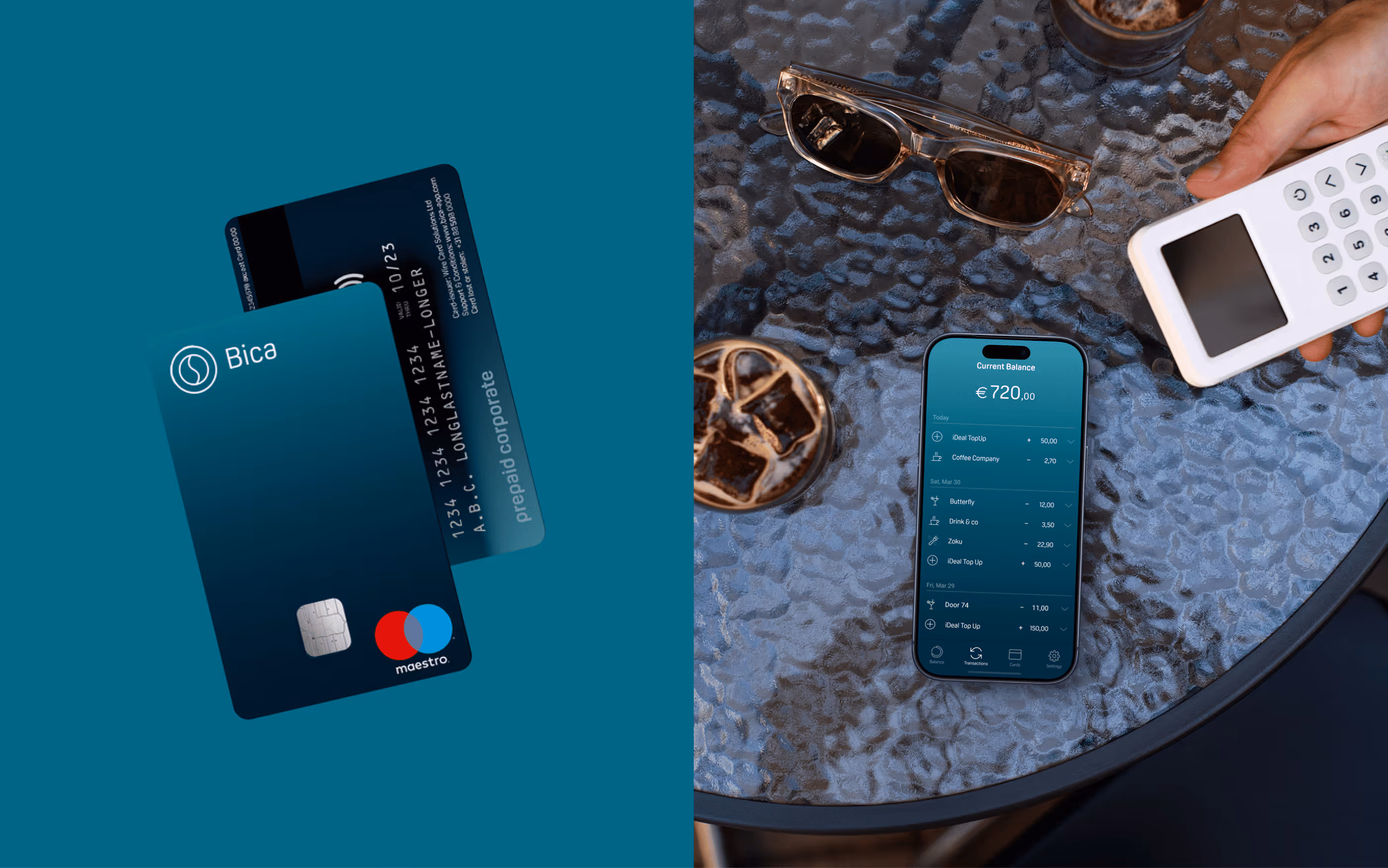
One card.
One app.
One bill.
No worries.
01/
background
Bica has one mission: simplify your business expenses. It is a mobile app built for entrepreneurs who deal with frequent food and beverage expenses while working outside the office. The Bica card makes it easy to buy anything needed for business and with the adjoined app seamlessly manage, track and control all expenses instantly.
The existing app was outdated and overly complex, built by developers, and required a complete redesign with a fresh, user-friendly interface and a reimagined user experience.

02/
Challenge & Objectives
Challenge:
The product relies on financial trust and a smooth onboarding experience, but the initial flows were too complex due to KYC, bank verification, and partner integrations. The challenge was to design a clear and intuitive interface that removed friction, reduced confusion, and helped users understand how the overdraft model works from day one.
Key design goals:
- Make the interface simple, friendly, and transparent
- Redesign onboarding, make it feel fast & safe
- Minimize cognitive load during daily usage
- Support future scaling with a flexible UI system
03/
UX Foundations
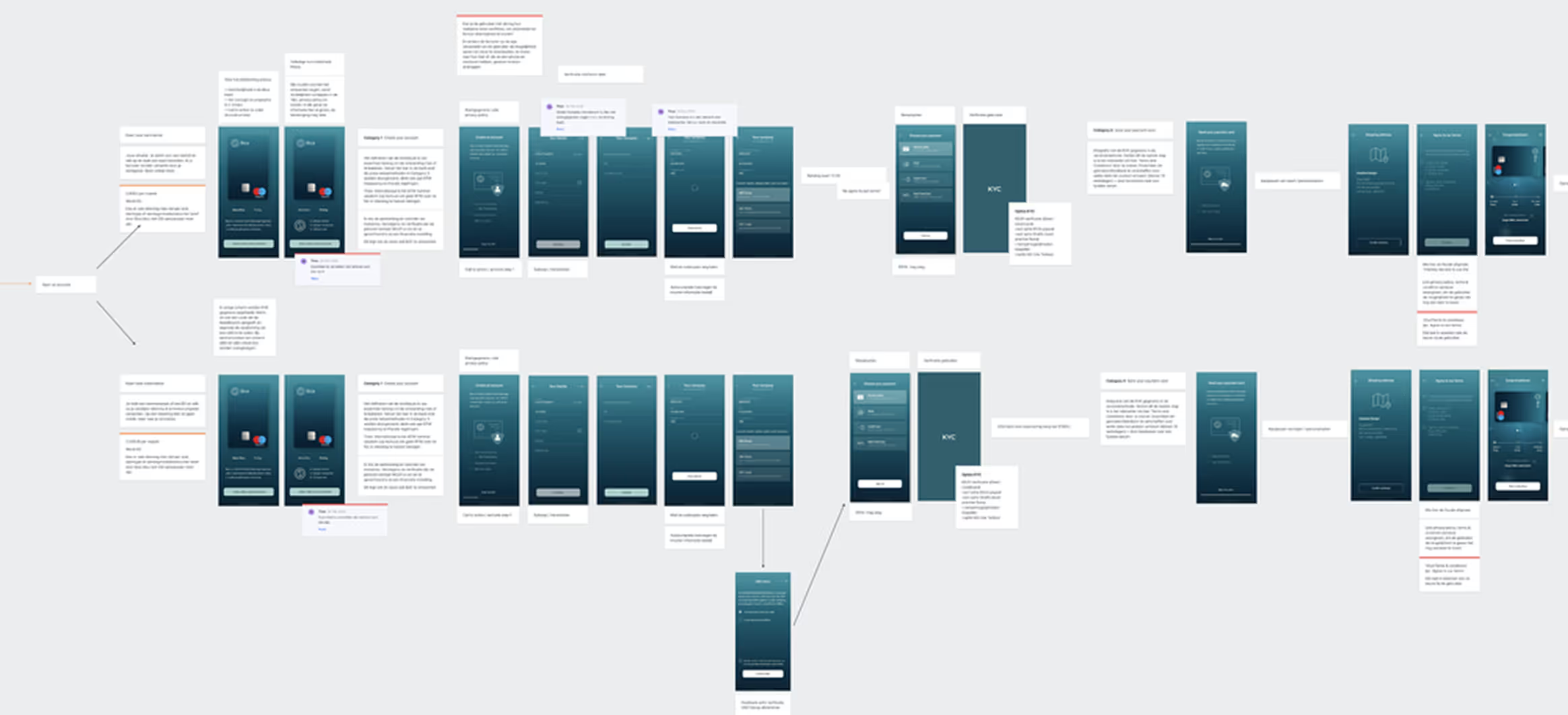
The onboarding and user flows had to be completely reworked due to new laws and financial regulations. Together with the team—and closely with our finance specialist—we mapped out the full set of user journeys and internal flows. Because this is a financial product, the logic behind overdrafts, limits, invoicing, KYC, and bank connections was pretty complex, so we broke everything down into detailed diagrams and step-by-step scenarios.
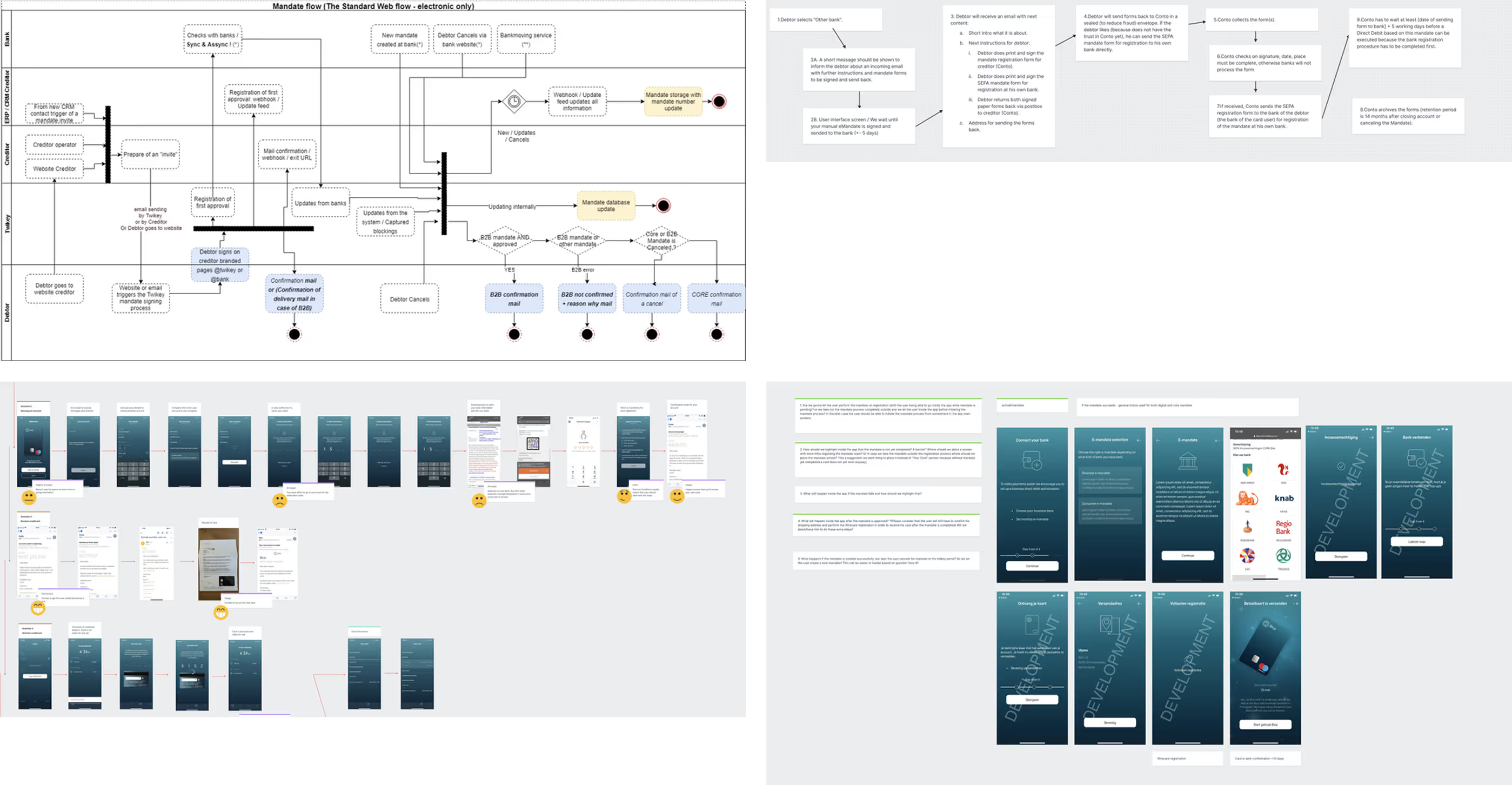
We also explored “day in the life” situations and compared competing products to understand how others handle similar flows. This work helped us untangle the complexity and set a clear foundation for the interface structure.
04/
final designs
The visual language needed to reflect security without feeling corporate or heavy. I created a clean, contemporary UI with a bright color palette, crisp typography, and simple layouts.
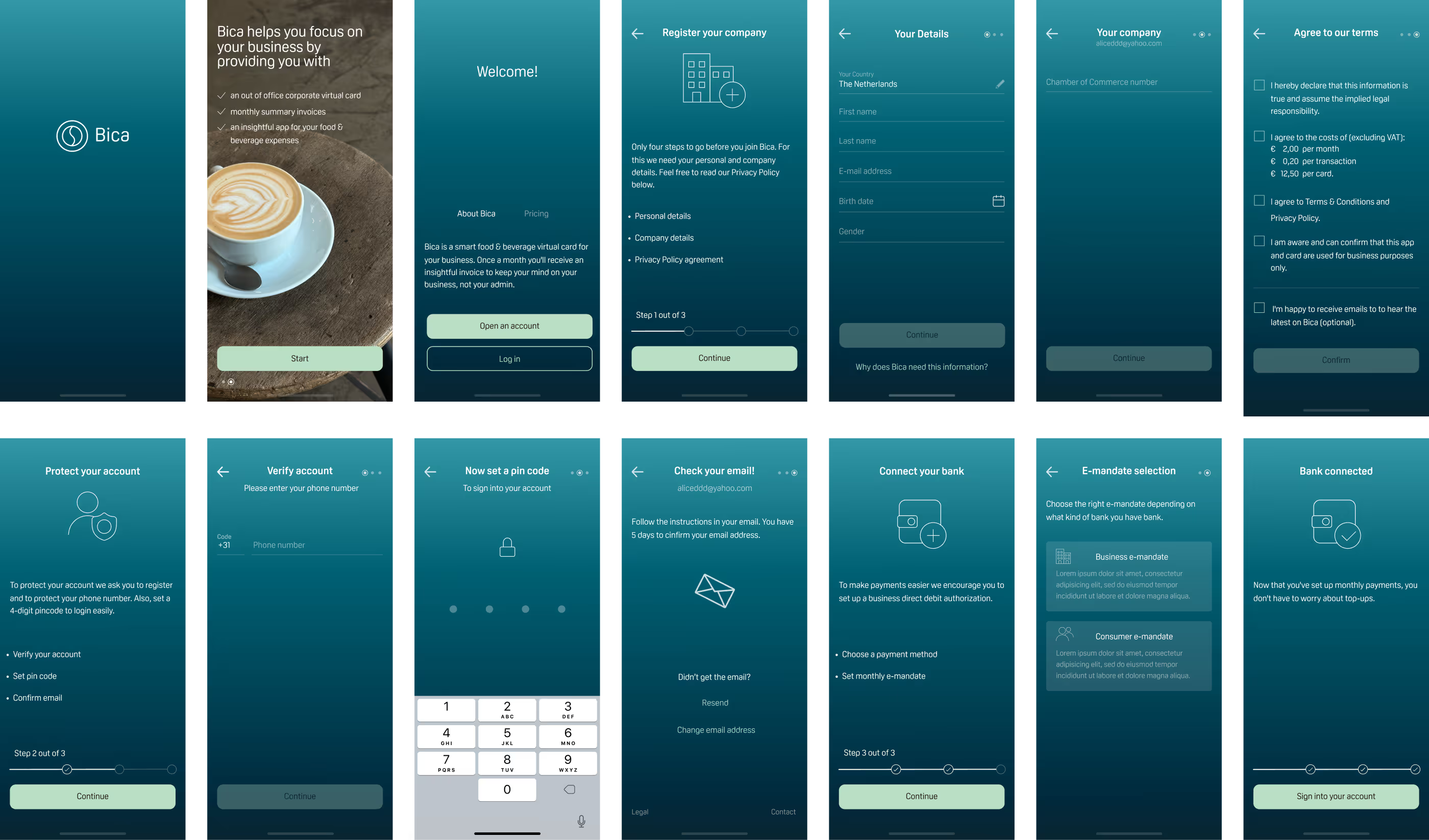
Onboarding
The screens below show only part of the onboarding flow. The full onboarding was quite complex due to strict financial regulations, KYC requirements, and multiple verification steps. My main challenge was to translate this complexity into an experience that felt simple, clear, and fast for the user. I focused on breaking the process into logical steps, introducing clear progress indicators, and using straightforward layouts and microcopy to guide users through each stage with as little friction as possible.
Transactions
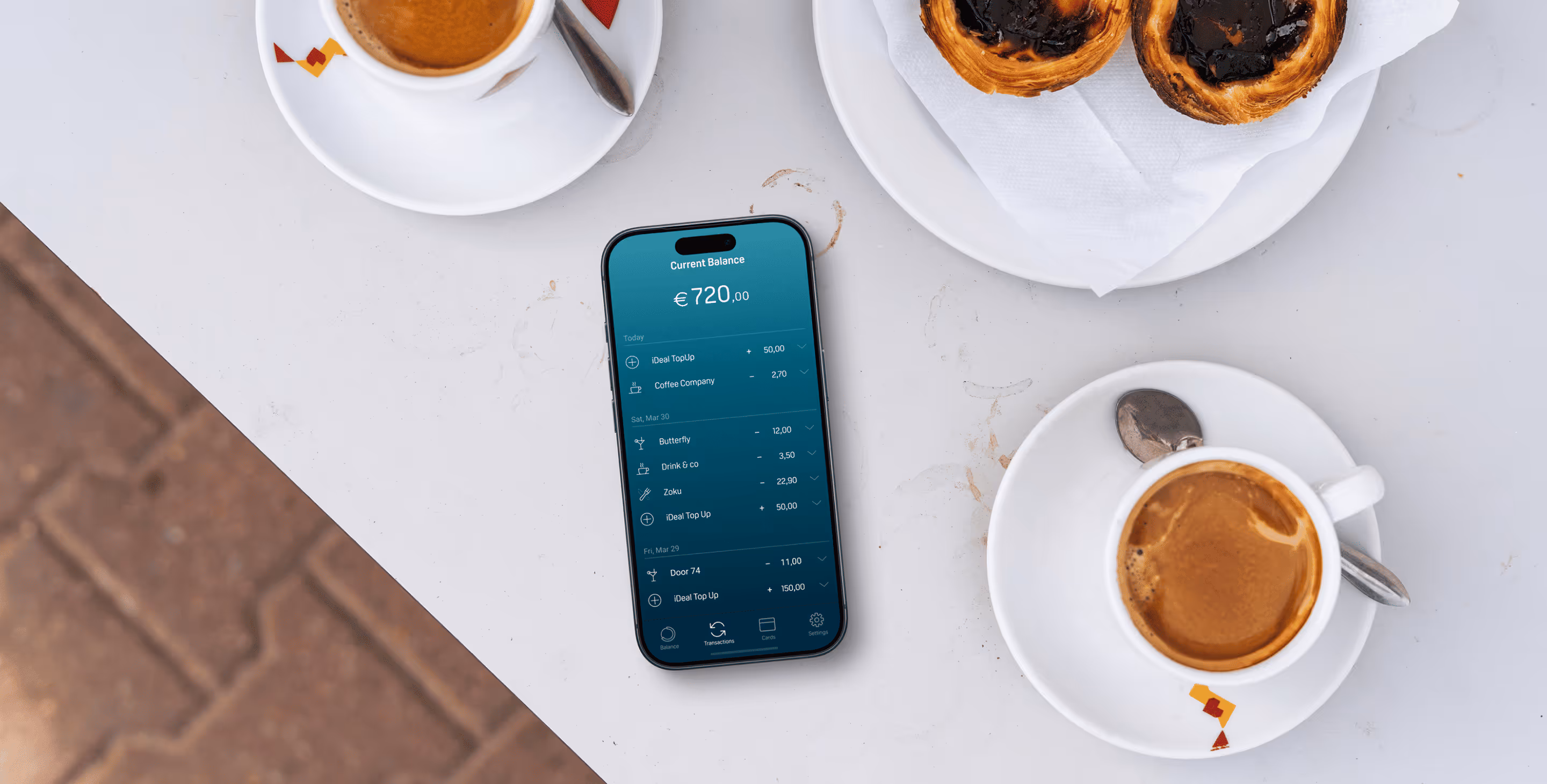
These screens show the core transaction experience. The focus here was on clarity and speed: users need to instantly understand their current balance, recent activity, and individual transaction details. I designed a clean, scannable list with clear visual hierarchy, intuitive icons, and expandable rows for deeper details without overwhelming the main view.
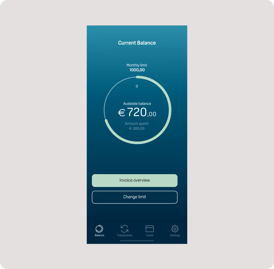
Balance screen
The balance screen gives users an instant overview of their available funds and monthly limit. I designed it to surface the information people check most often—current balance, amount spent, and remaining limit—using a clear visual hierarchy and a simple progress indicator. Frequently used actions, like viewing the invoice overview or changing the limit, are placed front and center to keep everyday financial management quick and effortless.
Random Act of Kindness
Random Act of Kindness (RAOK) is a feature designed to bring a human, emotional layer into an otherwise purely financial product. It allows users to send €2.50 to another Bica user for a coffee—no practical reason, just a simple gesture of appreciation or support. The idea was to encourage generosity, strengthen community, and reflect Bica’s belief that small acts of kindness can have a meaningful impact.
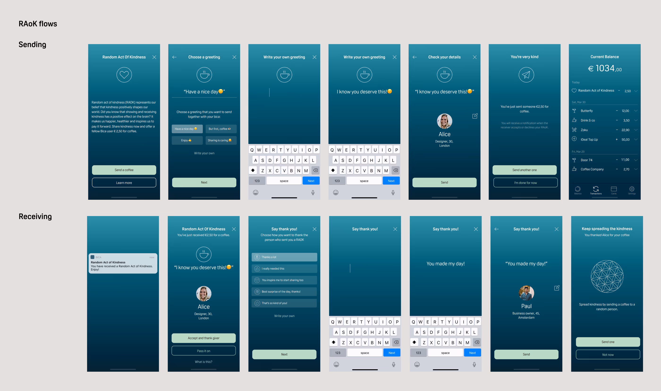
From a design perspective, the challenge was to make this flow feel lightweight and joyful, without compromising clarity or control. I designed both the sending and receiving experiences as short, guided flows with friendly microcopy, minimal decisions, and a sense of closure. The result is a feature that feels effortless to use and emotionally rewarding, while still fitting naturally into a regulated fintech product.
05/
outcomes
80%
of beta users completed onboarding without external support
-35%
onboarding drop-off during beta testing
90%
task success rate for core actions
The product was tested with a small group of beta users and showed strong early traction, but the project was ultimately paused during the COVID period.
06/
learnings
Designing for complexity
Financial products require breaking down complex rules and processes into clear, digestible steps for users.
Cross-functional collaboration
Working closely with finance and compliance experts ensures accuracy without sacrificing usability
Humanizing fintech
Emotional features like Random Act of Kindness can add warmth and meaning to otherwise functional financial products.
Designing for daily use
Frequently used screens must be fast to scan and effortless to understand at a glance.