
Company:
Allwayswithyou
Role:
UX/UI designer
Work I did:
UX/UI design
Strategy & direction
User testing
Research
Designing a companion app that helps older adults stay healthy, independent, and connected with their families
Allwayswithyou offers a service to help people remotely monitor their older parents and reduce the impact of social isolation.
01/
background
As populations age, maintaining independence and wellbeing among older adults has become a growing societal challenge. Many seniors wish to live in their own homes for as long as possible but lack accessible tools that support proactive health management and meaningful family connection.
Allwayswithyou set out to address this gap by developing a digital companion app that promotes healthy living, independence, and stronger emotional ties between elderly users and their families.
02/
Challenge & Objectives
Challenge:
Many older adults wish to live independently for as long as possible, but current products rarely support proactive care, meaningful connection, and simple health monitoring.
Goal:
Design a digital solution that extends older adults’ independence and wellbeing through proactive health management and family connection.
03/
research & insights
Methods used:
- Reviewed existing company research (personas, journey maps, previous findings)
- Conducted stakeholder interviews to clarify business goals
- Performed extensive secondary research on older adults’ use of technology
- Conducted 8 interviews: 2 with older adults (75+) and 6 with family members
Key insights:
Older adults:
- Generally positive toward technology but often need guidance.
- Prefer tablets for ease of use, though smartphone adoption is growing.
- Feel disconnected from family due to complexity of current tools.
- Are motivated by health awareness and increasingly use wearables.
Family members:
- Struggle to keep elderly relatives engaged and informed.
- Want visibility into loved ones’ health metrics to feel secure.
- Lack simple, unified solutions to connect and monitor remotely.
- Chose mobile phone as a preferred device
Opportunity:
Design a single, intuitive app that connects generations, encourages independence, and provides peace of mind for families.
Defining & Prioritizing Requirements
Together with the team, we defined the MVP scope and direction based on research insights and technical constraints.We decided to create a mobile and tablet companion app that serves both user groups — older adults and their family members — each with a tailored account experience.
The app would focus on three key goals:
- Health & wellbeing support through personalized insights and reminders.
- Connection & communication between seniors and family members.
- Independence for older adults, empowering them to manage their own health while staying supported.
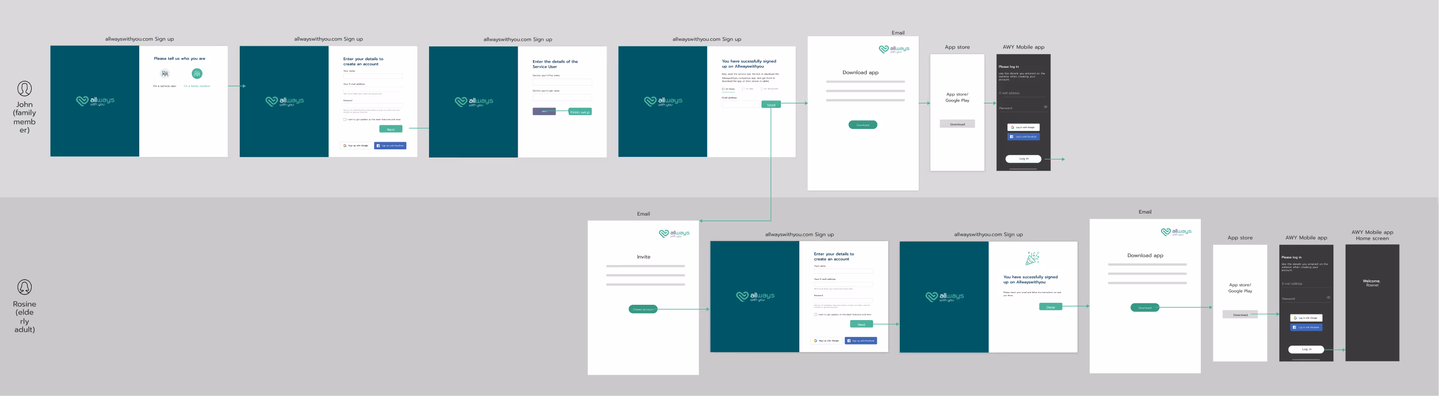
User journey & UX flows
To shape the product experience, I mapped out key user journeys for both elderly users and their family members — from onboarding to daily engagement and ongoing health monitoring.
This helped clarify the interaction model, identify friction points, and define a clear onboarding flow that balanced ease of setup with privacy and accessibility.
onboarding
04/
ideation & design
Once the strategy and requirements were defined, I began exploring ideas through quick sketches and low-fidelity wireframes. My goal was to design a simple, accessible interface for tablet & mobile.
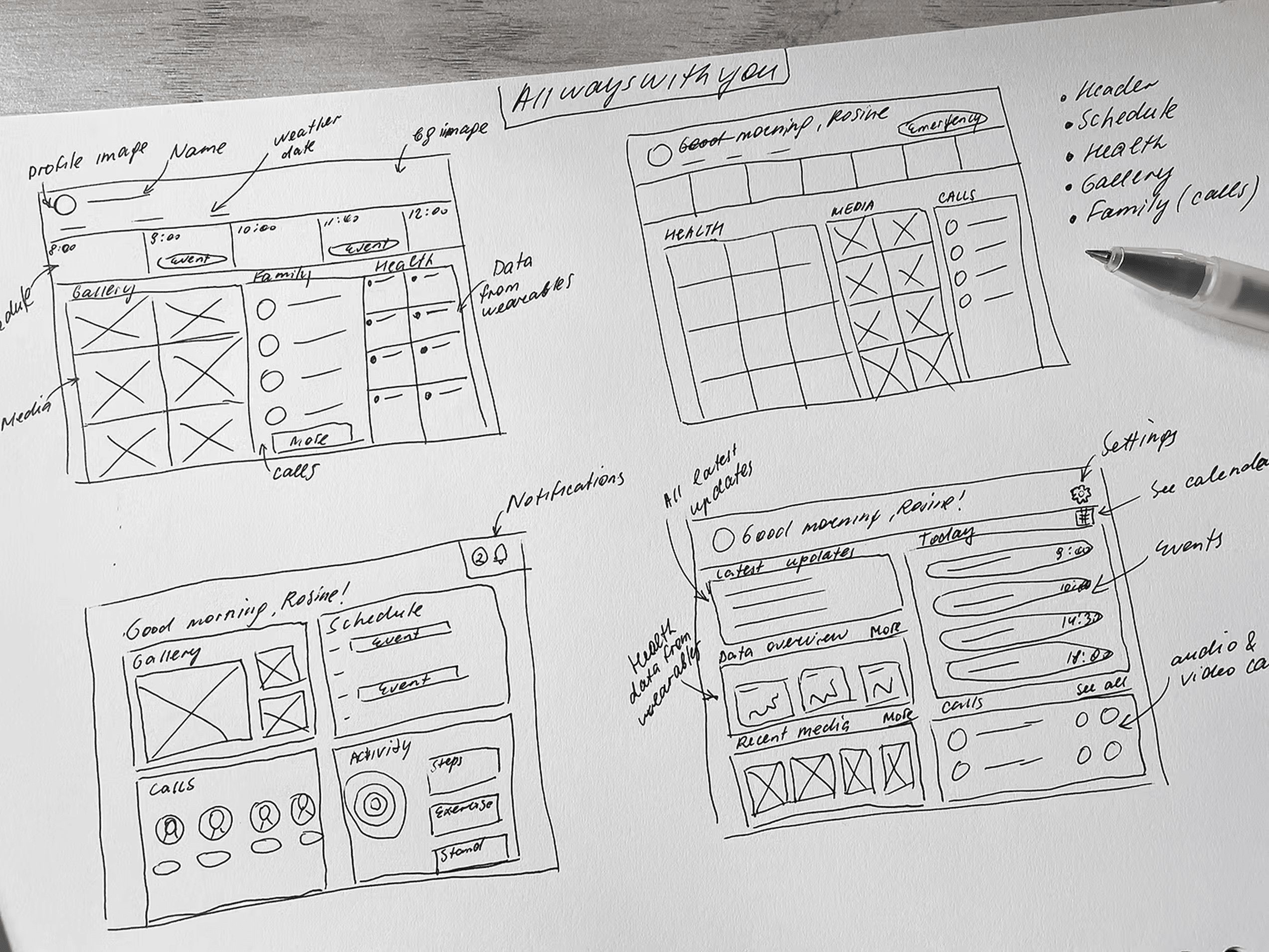
Given our diverse user base, I paid particular attention to readability, informationhierarchy, and interaction simplicity, ensuring that elderly users could navigate the app confidently.
After refining the flows, I created mid-fidelity wireframes and then translated them into high-fidelity mockups aligned with the brand’s visual language. The prototype was built for stakeholder and user testing.
05/
testing & iteration
When the prototype was ready, we partnered with a government organisation to access target users and ran weekly remote usability tests with seniors and their families. I worked closely with the researcher, observing sessions and turning insights into design improvements.
Key findings:
- Tablet-first design was overwhelming: too much information on one screen; few users owned tablets.
- Initially, onboarding was designed for family members to create and manage accounts for their elderly relatives, positioning seniors as passive users. Testing revealed that many older adults are increasingly tech-savvy and value their independence. To support both autonomy and accessibility, I redesigned the onboarding flow to be flexible, allowing either the elderly user or the family member to initiate setup and invite the other.
- Trust and reassurance are key: Older users wanted visible confirmation that their data is private and secure, especially when sharing health information with family members.
- Tone and language matter: Complex or clinical wording made elderly users feel alienated. They preferred warm, encouraging language and simple phrasing.
- Visual design accessibility: Larger touch targets, high-contrast colors, and clear typography were essential to make the app easy to use
06/
final designs
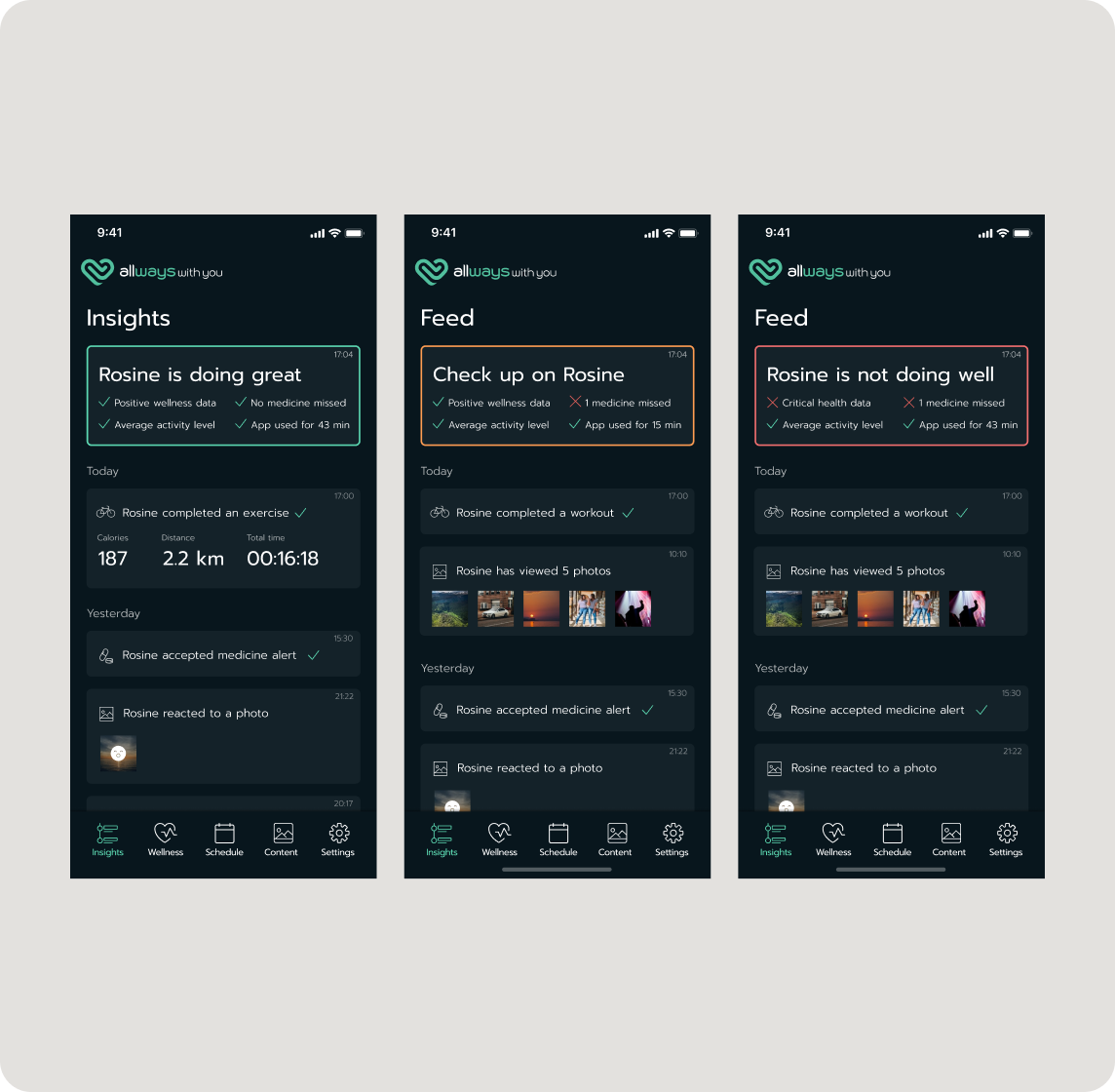
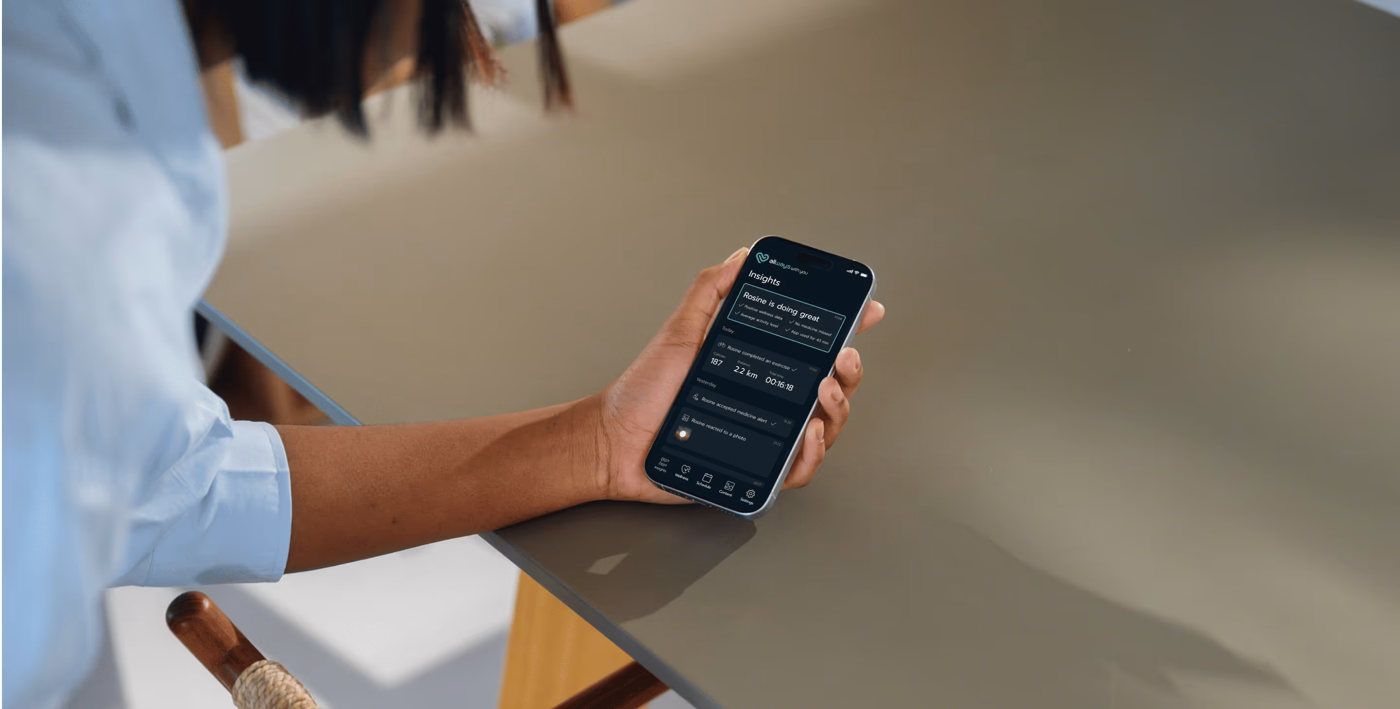
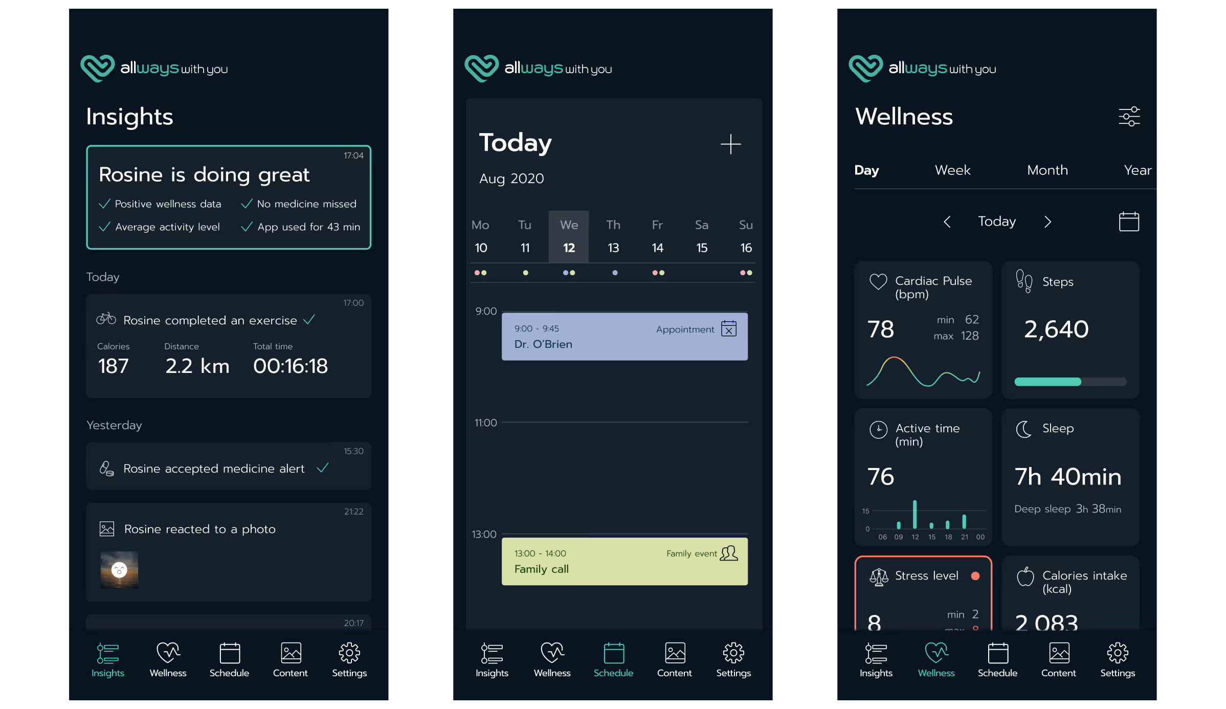
Personalized Insights
I created a personalized feed with a clear Highlights Overview at the top that instantly summarizes how the elderly family member is doing. This quick status block is designed to reduce stress and help families understand the situation at a glance.
For family members, this means real-time updates they have permission to view: workouts completed, photos viewed, medicine alerts, and any unusual patterns.
For elderly users, the feed includes proactive recommendations for exercise, diet, and wellbeing, tailored to their health plan.
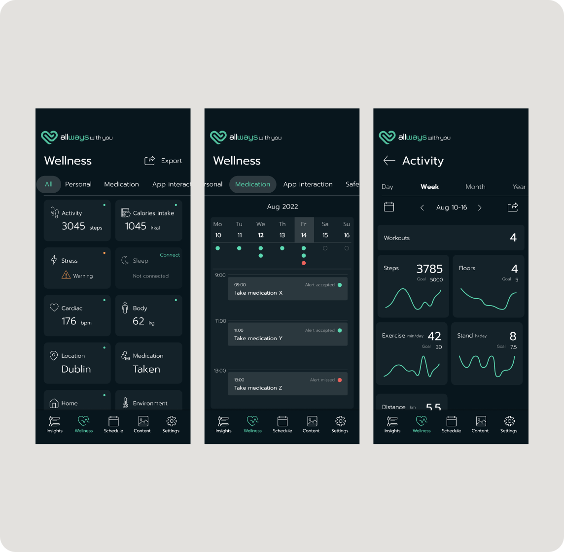
Promoting Proactive Health Management
The Wellness dashboard is the heart of the app, designed for comprehensive yet accessible health oversight. The main screen provides a simple, high-level summary of vital metrics. To prevent overwhelm, the design uses a progressive-disclosure model, allowing users to switch views between All data and focused categories like Medication.
Tapping any card reveals detailed data, including a dedicated Workouts history. This structure effectively balances simplicity for older users with the depth needed for proactive self-management and family reassurance.
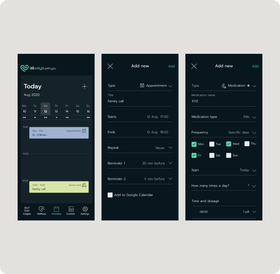
The Centralized Schedule
The Schedule feature was designed to serve as a single source of truth for all important appointments, reminders, and family interactions. The main view presents a clear, day-by-day calendar focused on the current week, where different event types are easily distinguishable.
Dedicated Medication flow enables precise tracking of dosage, frequency, and time. This functionality empowers seniors with independent health management while ensuring critical tasks are never missed.
08/
outcomes
The product is now in beta with patients from several national health organisations in Ireland. With AI rapidly advancing, the next phase will focus on integrating intelligent health monitoring and predictive insights to help users stay ahead of potential issues.
09/
learnings
Assumptions about elderly users age quickly
I learned not to underestimate seniors’ tech confidence. Many were more capable than expected, and their desire for independence was much stronger than early assumptions suggested.
Continuous testing is non-negotiable
Weekly usability sessions changed the direction of the product multiple times. Many issues only surfaced when watching real seniors interact with the prototype, not in internal reviews.
Accessibility must be built in early
Increasing contrast, enlarging target areas, and simplifying flows had to be addressed at the foundation of the design — not as last-minute tweaks.
Clearer direction for future product decisions
Research and testing surfaced opportunities for new features (fall detection, improved medication logging, automated check-ins), giving the company a roadmap grounded in real needs.